Colour choices in context
Dark frames and pale render: choose the sample together
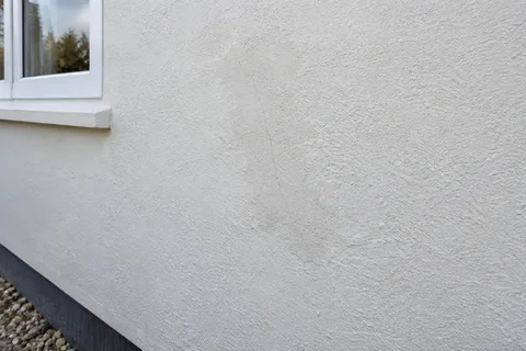
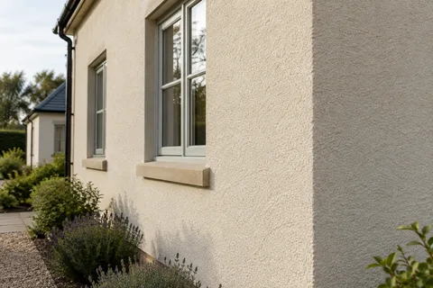
A pale render sample can look restrained on its own and surprisingly bright beside a dark window frame. The colour has not necessarily changed; the surrounding contrast and the way light falls on the texture have changed the impression. That is why a useful sample decision belongs on the building. This guide sets out a straightforward process for comparing colours without turning the choice into an endless collection of tiny swatches or relying on a photograph of someone else's house.

On this page
Start with the materials that are staying
For a Wilmslow rendering project, identify the fixed parts of the exterior before choosing the new surface. Window frames, brickwork, roof coverings and doors provide the setting in which the render will be seen. If some of those items will be replaced, use their confirmed samples or references rather than selecting render around a temporary arrangement. A decision made against old glazing may feel different once the intended frames arrive.
Look at more than the frame's broad colour description. A dark frame can have a particular undertone and sheen, while adjacent seals, sills and trims may differ again. The render does not need to imitate all of them, but they should be present in the comparison. A pale wall can either emphasise the opening or make the whole composition feel calmer, depending on the actual combination.
This is also the point to decide whether the project changes only colour or replaces the render system. A compatible recoating works with a suitable existing texture. A new silicone finish or monocouche system can change that texture as well. Keep those alternatives distinct so a preferred photograph does not accidentally approve a construction scope that has never been assessed.
Reduce the shortlist before enlarging the sample
Use charts and small samples to eliminate colours that clearly do not suit the retained materials. Then move a limited shortlist to a meaningful physical comparison. Too many near-identical swatches can make the decision feel less certain because the eye keeps comparing tiny differences that may be less important at wall scale. The aim is a usable selection, not proof that one colour is objectively correct.
Give each option its full product and colour reference. Names such as ivory, cream or warm white can mean different things across manufacturers. The surface texture should also be identified. If one option is displayed on a fine grain and another on a smoother board, the comparison contains more than a colour difference. Keep that visible rather than attributing every change in appearance to the pigment alone.
Agree who makes the final decision. Where several household members or a designer are involved, view the same samples and record one clear approval. Otherwise, a contractor may receive a chart number from one conversation and a photograph from another. The sample should settle the choice sufficiently for the work to proceed, while acknowledging that daylight will continue to change how the finished wall looks.
Place the sample beside the actual opening
A sample in the centre of an unrelated garden wall may show the product but not the intended relationship with the frame. Use a position where the retained window, sill and neighbouring masonry can be considered together. Where direct application is not appropriate, a representative sample board can still be positioned thoughtfully. The important point is to compare the materials in context rather than separately indoors.
Make the sample large enough to show the intended texture. A narrow stripe can exaggerate the influence of its neighbours and gives little sense of a broad elevation. The sample method should suit the product and the building, with any necessary permission or protection considered. It should not create an unsuitable patch that later needs unnecessary removal merely because the colour exercise was improvised.
Allow the sample to reach the condition appropriate for judging it. Wet material and recently applied coatings can appear different from the eventual finish. The contractor or manufacturer guidance should inform the review point. Comparing one dry sample with another fresh one is not a fair basis for a final choice, even if both are nominally the same product type.
| Variable | Keep it clear |
|---|---|
| Colour | Use a small shortlisted set with exact references |
| Texture | Test the actual proposed grain or finish |
| Position | Include the retained frame and neighbouring materials |
| Condition | Compare samples at the appropriate dry stage |
| Light | Review representative daylight rather than one photograph |
View it as part of the whole elevation
Stand at ordinary viewing positions: the path, drive or garden, as well as closer to the window. The close view shows grain and the material junction; the wider view shows the visual weight of the pale wall and dark opening together. A colour that works well in a small corner may feel more dominant across a complete façade. Neither view replaces the other.
Review representative daylight rather than waiting for a single flattering moment. A shaded elevation and a sunlit return can look different with the same finish. This is normal context for the decision, not necessarily evidence that different colours must be specified. If you do choose different treatments, make their boundaries deliberate and keep the schedule clear so they are not confused during application.
Photographs are useful records, but phone processing and screen settings influence their appearance. Keep them alongside the physical product references rather than use them as the sole colour standard. A photograph can identify the approved sample and its position without being treated as a calibrated promise that the completed house will look identical on every device and at every time of day.
Keep texture and surface condition in the conversation
Dark frames can draw attention to the crispness of reveals and the plane of the adjoining wall. The decorative coat depends on suitable preparation beneath it. If the existing surface is uneven or contains repairs, establish how those conditions will be treated before expecting the chosen colour to produce a uniform result. Colour selection is not a substitute for a complete wall specification.
For one elevation, define the boundary with the remaining finish and consider how weathering affects the comparison. For whole-house work, review whether all elevations share the same texture and background. A coordinated colour does not require every underlying preparation to be identical. The schedule should preserve those differences while keeping the approved appearance understandable.
If a future extension or window replacement is likely, retain the references and sample record. A later product may not reproduce the aged wall perfectly, but the information gives the next designer or contractor a reliable starting point. A remembered description such as the pale one beside the black frame is much less useful once the original samples have gone.


Turn the choice into a concise instruction
The final approval can be simple: the named product, colour, grain, sample location and elevations to receive it. Include any different treatment for reveals or other features. Keep this with the specification and make sure the contractor uses the same current version. That prevents a well-considered choice being diluted by inconsistent shorthand later in the project.
The result should be confidence about the combination you have actually seen, rather than a claim that one shade is universally best for dark windows. A physical comparison, sensible viewing conditions and a clear reference are enough to make the decision practical. The finished render can then be judged against an agreed choice that belongs to this house and its retained materials.
Common questions
Can a colour chart replace a wall sample?
It can narrow the choice, but it cannot reproduce the scale, texture and surroundings of the finished elevation. Use the actual proposed product on a representative sample before final approval. Keep its reference so the choice is identifiable after the sample is no longer accessible.
Should the render exactly match a white door or trim?
That is a design choice rather than a technical requirement. Different materials and sheens can make nominally similar colours look different. Compare the actual materials together and decide whether a close relationship or a deliberate contrast gives the result you prefer.
See housing and planning information for Wilmslow and nearby places, including the source and geography behind each figure.