Texture changes the colour comparison
One colour across different render textures
One colour reference can seem like a simple way to unify an exterior. It becomes less simple when the walls have different textures or need different systems. A fine grain, a scraped mineral surface and an older painted finish can catch light differently even when their colours are intended to coordinate. The aim is to choose a relationship that works on the building, with a clear record of each product, rather than promise that every surface will become visually identical.

On this page
Identify the surfaces before choosing a common colour
On a Wilmslow rendering project, a useful schedule begins with the actual wall areas. An extension may use a new system, the original house may retain sound painted render and a traditional section may need a compatible repair. List those areas separately. The shared colour idea can then be considered across them without erasing the technical differences that determine their specifications.
Do not assume that every texture should receive one universal coating. Compatibility depends on the existing layers and proposed products. A material suitable for one modern system may not be appropriate on traditional masonry or an uncertain old paint. The technical assessment should establish viable options first. Colour coordination can take place within those options rather than dictate an unsuitable treatment.
Understand why the grain changes the impression
Texture produces small shadows and highlights. A coarser surface can read differently from a fine one, particularly when the light travels across it. The effect also changes with viewing distance: close up, the individual grain is apparent; from further away, the surface reads as a broader tone. A small smooth chart sample cannot reproduce all of that behaviour.
Silicone rendering commonly involves a textured decorative coat within a specified system, while monocouche can provide a different scraped mineral finish. Their visual relationship should be reviewed on actual samples. It is misleading to describe one as the same appearance in a different material without considering the grain, finishing method and background that influence the result.
Build a sample set that answers the real question
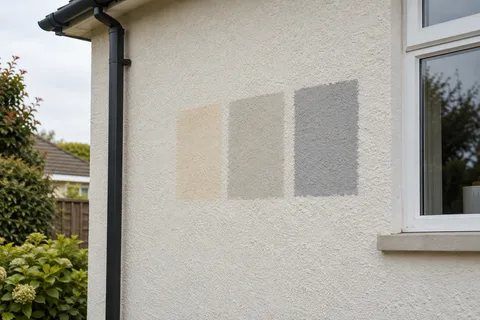
If three surfaces will share a coordinated colour, compare the relevant product-and-texture combinations together. Label them clearly so the review does not become a collection of anonymous pale boards. The sample should identify the system or coating, colour and finish. Keep the proposed locations alongside those details, particularly if the same house uses more than one specification.
View the set beside retained windows, brick and other materials. This helps judge whether a slight difference between textures feels coherent or distracting in context. The objective need not be perfect sameness. A deliberate relationship between materials can be more convincing than an unachievable promise that a new scraped face will look exactly like an aged smooth coating.
Samples should reach the appropriate condition before comparison. A recently applied patch may not represent the eventual appearance, and different products may need different treatment or review timing. Follow the relevant specification rather than compare every sample immediately after application for convenience. The contractor should explain what stage the sample represents and whether any later decorative treatment remains to be applied.
Keep a simple photograph showing each label beside its sample. It will not calibrate the colour, but it will prevent a later mix-up about which product-and-texture combination was approved for each elevation.
| Surface | Information to retain |
|---|---|
| Fine textured system | Product, grain and colour reference |
| Scraped mineral finish | Product, finish method and approved sample |
| Retained painted render | Existing layers and compatible coating specification |
| Traditional lime repair | Repair material and suitable decorative treatment |
Separate colour coordination from repair extent
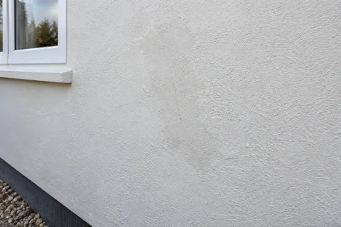
A repaired patch can differ from the surrounding wall because of plane and texture as well as colour. Applying one coating across both may reduce tonal variation while leaving the surface difference visible. If the owner expects the patch to disappear entirely, that expectation needs discussion before the work is agreed. A decorative colour choice alone cannot establish the necessary preparation or repair method.
The render repair guide distinguishes the technical repair from broader finishing. Retain that distinction in the quotation. It may be appropriate to repair only the defective material and decorate to a natural boundary, rather than remove sound render merely to create a larger uniform patch. The suitable extent depends on the condition and the agreed appearance, with neither assumed from the other.
Traditional sections may need a different decorative route
Where lime render is present, the final finish must suit the construction and retained layers. A breathable description on a label does not by itself establish compatibility. Appropriate technical or conservation advice may be needed before a colour product is selected. The colour schedule should record that different route clearly rather than place traditional and modern walls under one generic paint instruction.
This does not prevent a coordinated exterior. It means the visual comparison must use the appropriate products for each area. If the closest suitable options differ slightly, review them on the building and decide whether the relationship is acceptable. A responsible specification explains the choice instead of concealing the distinction behind a common colour name that suggests more precision than the materials support.


Consider the orientation and stopping points
The same sample can appear different on a shaded side wall and an open frontage. When the building already has different textures, orientation can add another difference. Review representative positions before deciding whether a contrast is caused by the product or simply the setting. A photograph taken at one moment should not become the only standard for every elevation.
Natural breaks can help organise changes. Corners, recesses and defined architectural elements provide clear boundaries between specifications. A transition halfway across an uninterrupted face is more demanding visually and may need a different design approach. For whole-house rendering, place these boundaries on the elevation schedule so the finish team is not left to infer them from a general colour note.
Keep the application scope exact
If a colour-change coating is proposed over retained render, state which surfaces it includes and which remain exposed. The product and preparation may differ from the new render next to it. A quotation should make that visible, including repairs, cleaning and primer where specified. It is not enough to instruct everyone to use the chosen colour and assume the background questions have been resolved.
Materials and application conditions need to follow the selected product guidance. Where work is phased, record the relevant batches or supplied product information as part of the project record. A later phase may still look different because the earlier surface has aged or the conditions vary, so the schedule should not promise an exact future match without qualification.
Approve a relationship you can describe
The final instruction should identify each surface and its product, with the accepted samples retained or clearly recorded. State whether the intent is a close visual match or a coordinated contrast. This simple distinction can prevent disagreement later when somebody assumes that using one colour name meant every texture would look indistinguishable.
At handover, keep that schedule with maintenance information. Future repairs and extensions can then begin from known materials rather than a remembered overall colour. A coherent exterior does not depend on pretending that texture has no effect. It depends on making the differences visible during selection and choosing a combination that works at the scale of the building.
Common questions
Can two manufacturers' matching colour names be treated as identical?
No. Names and reference systems differ, and the surface texture can change the perceived result. Compare physical samples of the actual proposed products. If a close relationship is important, agree that relationship visually rather than relying on a shared descriptive word.
Is a colour difference always an application defect?
Not necessarily. Texture, lighting, age and the materials themselves can influence appearance. A concern should be assessed against the approved specification and sample, with the relevant conditions understood. That does not remove the need to investigate genuine inconsistency; it provides a fair basis for the discussion.
See housing and planning information for Wilmslow and nearby places, including the source and geography behind each figure.